Let's All Point And Laugh At The Stupid Ugly Trump-Pence Logo!
It's actually really irritating, no matter how it's packaged
One thing Donald Trump always seemed to understand was branding -- getting the Trump name in gold on every goddamned flat surface available. Very classy. Even those stupid "Make America Great Again" hats are strangely iconic, no matter that they're destined to be as ubiquitous at yard sales in 2017 as Bigmouth Billy Bass singing fish plaques. But this logo for the TrumPence campaign?
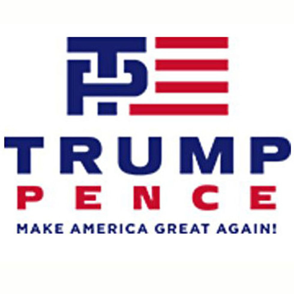
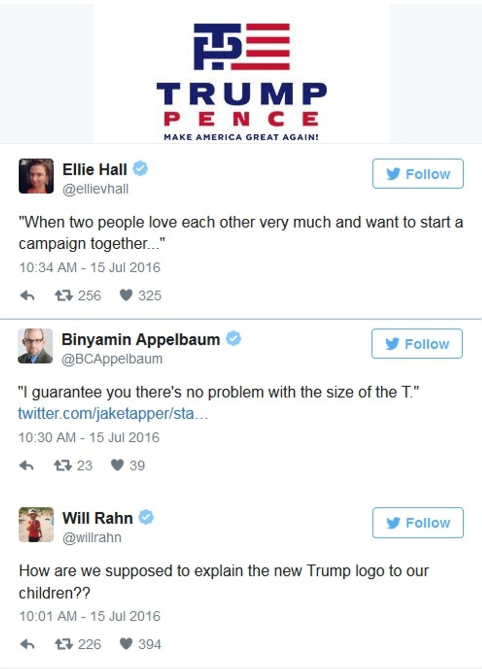
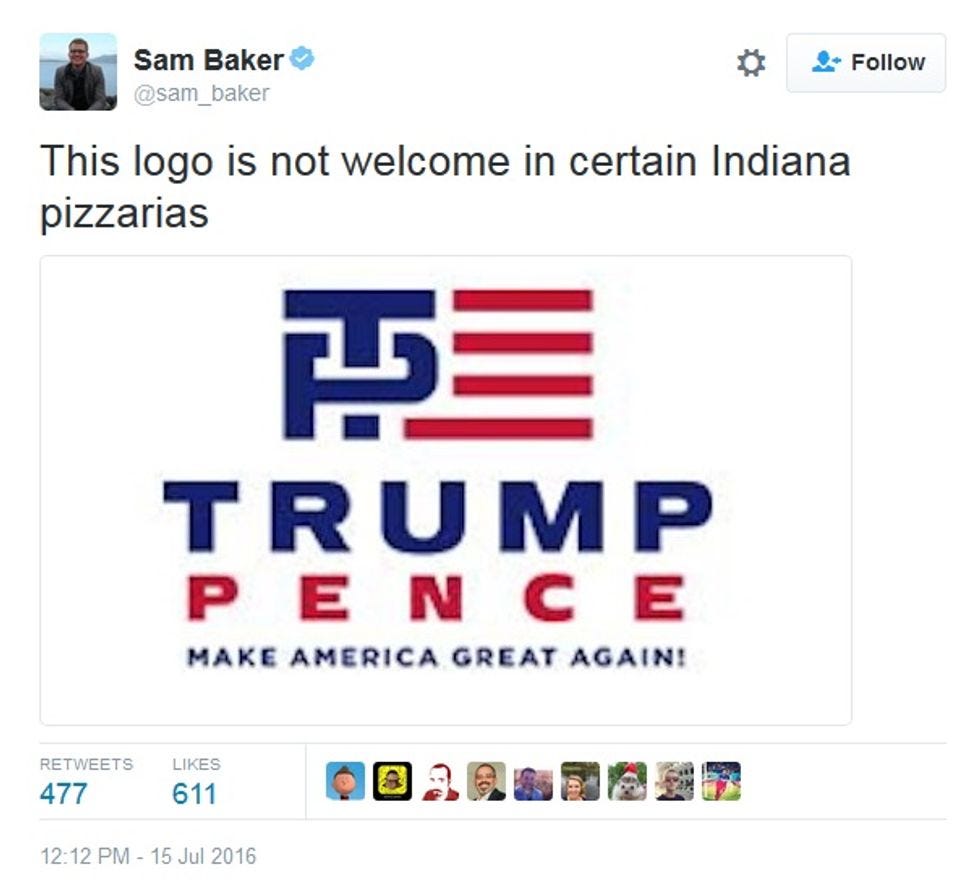
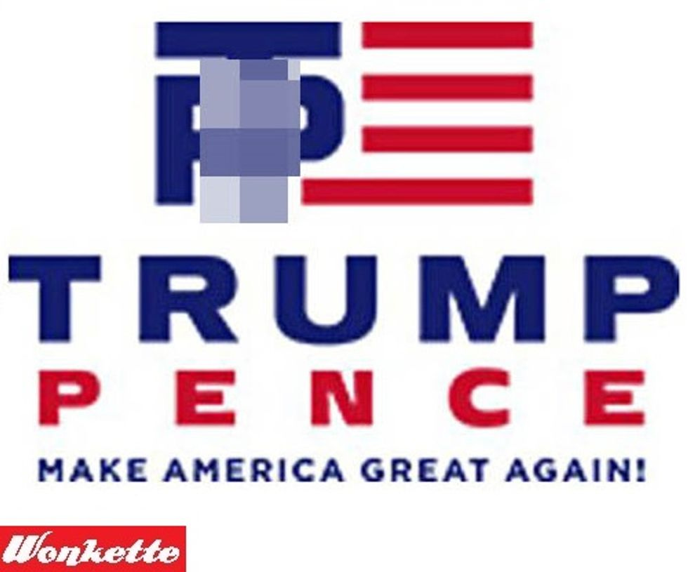
It's just fucking ridiculous. Happily, the internet makes ridicule easy! The shaft of the T penetrating the hole in the P -- it almost seemed to make people think maybe the logo was suggesting something. And of course it is: Donald Trump is clearly the top, and Mike Pence the bottom. The Tweetosphere was quick to reply, because it's Friday and the news has been terrible and we are all desperate to laugh at something incredibly tacky. First up, the greatest retired Congressman tweeting today, John Dingell , who was blessed by his parents with a name that made him an expert on a suggestive jokes:
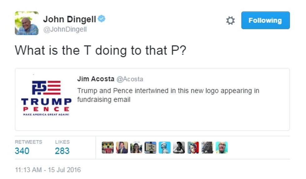
Clearly, everyone could use some TP for their Dingell berries.
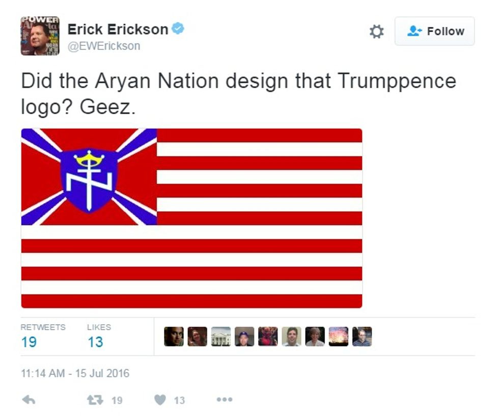
Erick Erickson found the logo vaguely suggestive not of sexxytime, but of neo-Nazis, which is kind of silly, since the candidate himself takes care of that:
Ubiquitous internet artgoofster darth™ made the inevitable gif, because that is how he rolls:
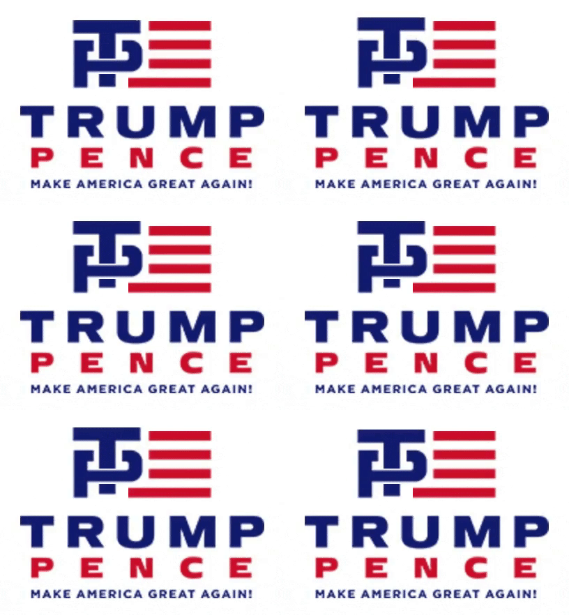
A further benefit of this version: It reminds us that Trump will do for America what he did for students of Trump University.
Here are a few collected by Vox...
And one from the Hill...
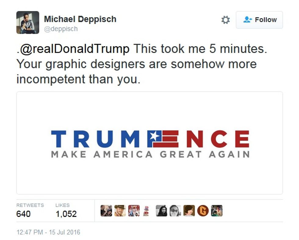
And then there were suggestions for anything that looked less silly:
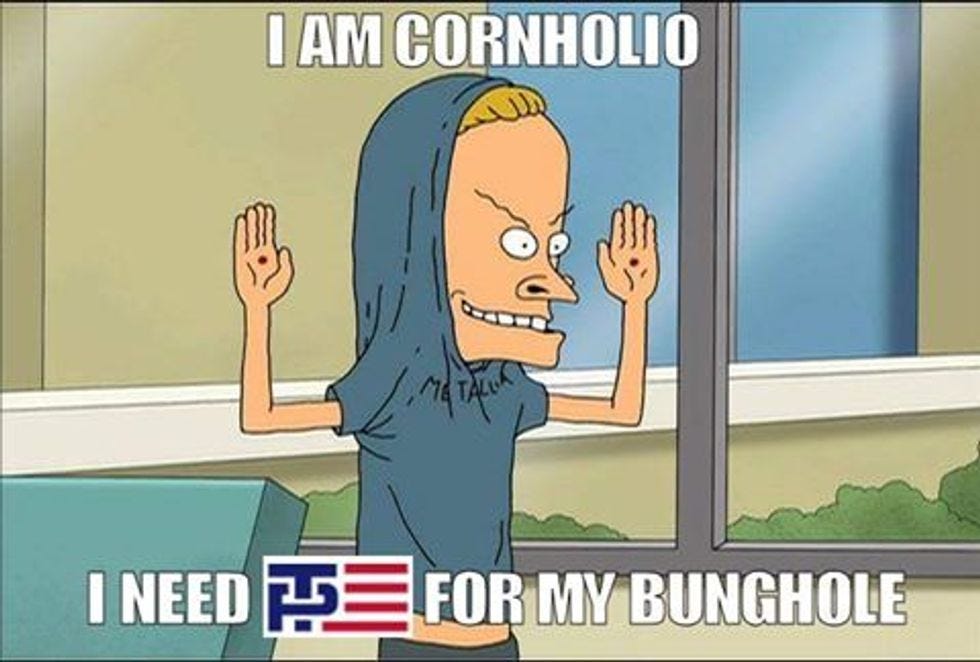
Our favorite of the bunch:
Finally, we offer this, should the Trump/Pence campaign need to visit Japan to yell at them about auto exports:


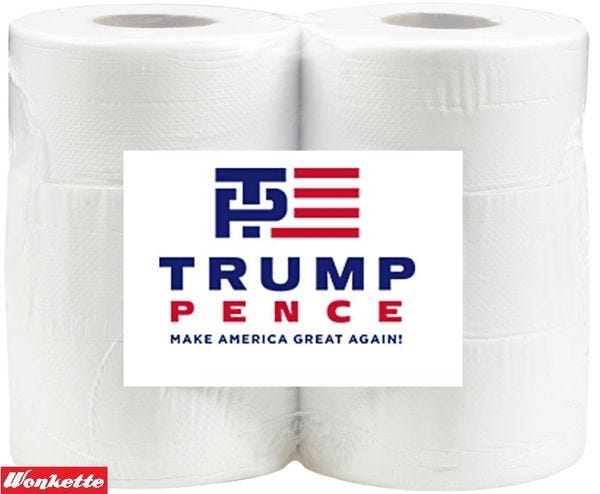
But we all love Donna Rose's Lego happiness
https://twitter.com/JerseyJ...