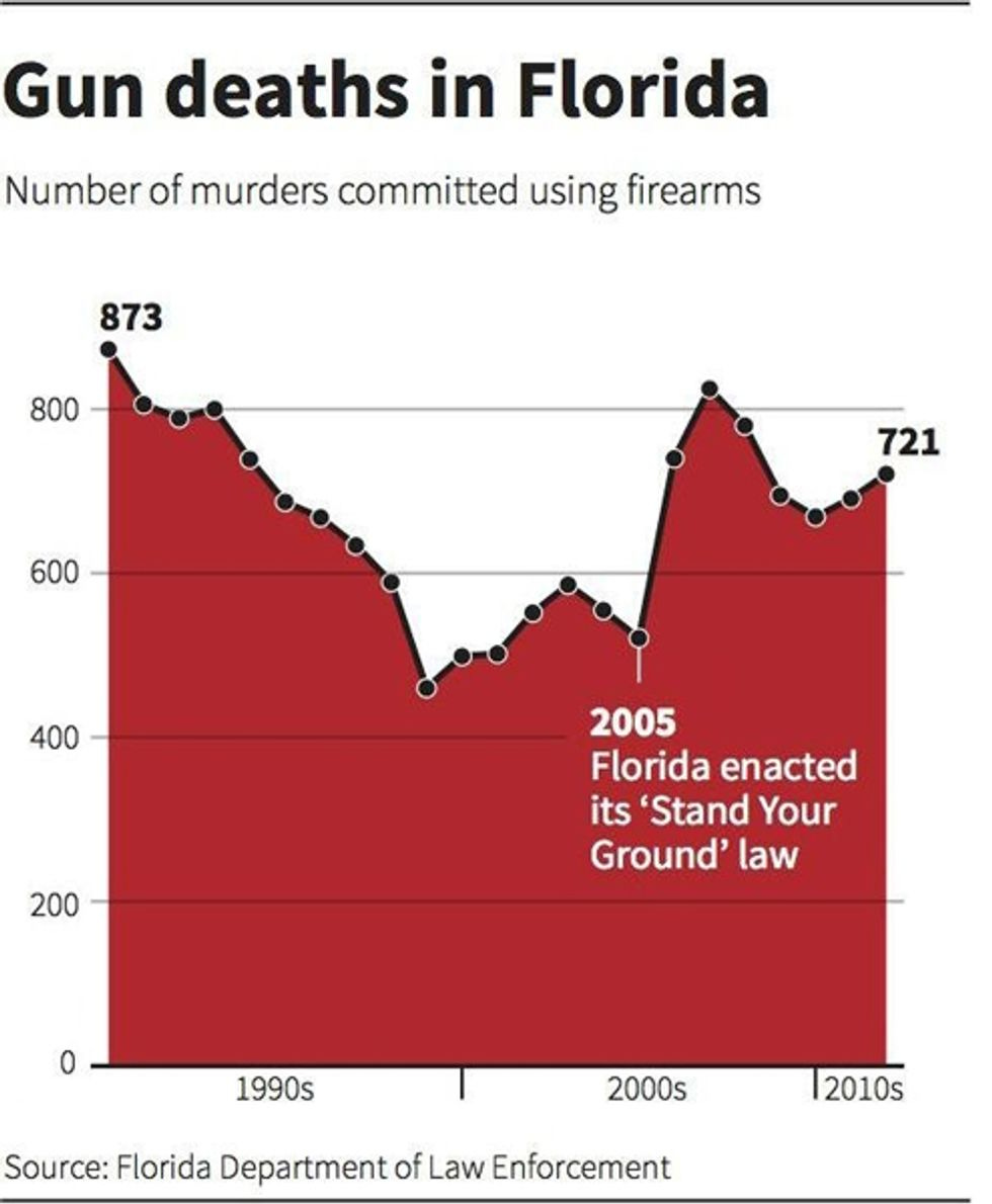
Reuters' Cool Upside-Down Chart Makes 'Stand Your Ground' Look Awesome
Now here's an impressive-looking chart from Reuters that was all over the Twitterverse this weekend. Quick -- after Florida adopted "Stand Your Ground" in 2005, did gun deaths increase or decrease? Well of course they decreased, says your brain, which learned to read charts in elementary school -- look at that awesome downward slope in the numbers, because a line on a chart going down always indicates a decrease in something, which is why a slope like that in a New Yorker cartoon about Wall Street would be followed by a banker jumping out a window. And then of course you look at what the chart "actually" says, and notice that "zero" is at the top of the chart, and you realize gun deaths increased sharply -- but by now the cartoon banker has gone splat (we can always get more off a desert island cartoon).
The artist has said that she was inspired by this chart showing the number of Iraq War deaths, which uses bar graph lines to give the impression of blood dripping down the page. Of course, when you use a line graph instead of a bar graph, it doesn't look like blood, it looks like a torn window shade (from getting shot! ) or something. The Iraq chart works, the Florida chart pretty much sucks, because getting cute with the conventions of charts gave a totally wrong impression of the trend she was trying to illustrate.
Happily, there have been plenty of folks on the web who were willing to Fix That For Ya, like this example from Business Insider:

This version not only clearly shows the number of gun deaths skyrocketing after "Stand Your Ground" was enacted, it also makes it much clearer that deaths were declining from the early to late 1990s, which didn't particularly stand out in the first version either.
And don't even get us started on the terrible labeling -- is this a chart of all deaths caused by shootings, or of homicides (which would exclude suicides and some accidents), or is it a chart of murder convictions, which is a really different thing? It matters a lot, since "Stand Your Ground" defenses would convert a lot of the third group into merely the second -- see also George Zimmerman and Michael Dunn.
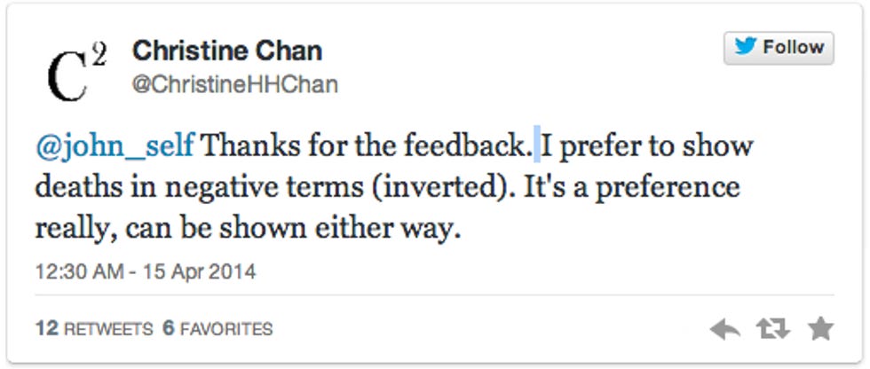
The good news is that a chart that's this completely screwy makes news, and maybe even makes some people less likely to be fooled by bad charts (a blogger can always hope). The rotten news is that plenty of charts lie more subtly, and deliberately, than this one, which ended up terrible not out of an intent to deceive, but to be pretty, if we take Christine Chan's word for it, which, actually we don't, because Christine Chan says things like this:
.

Nope, nyet, nein, INCORRECT. It is not a "personal preference." Besides, as C.J. Cregg knows, there are some things you just don't put upside down in a visual representation, because you'll freak people out:
[ Pacific Standard / Visualizing Data / Business Insider ]
Follow Doktor Zoom on Twitter. He is also amused by what happens when you put the Americas on their side. Quack!


At least Florida put an end to that "national trend" nonsense.
Because other states don't have the huge handicap that Florida does: Floridians.